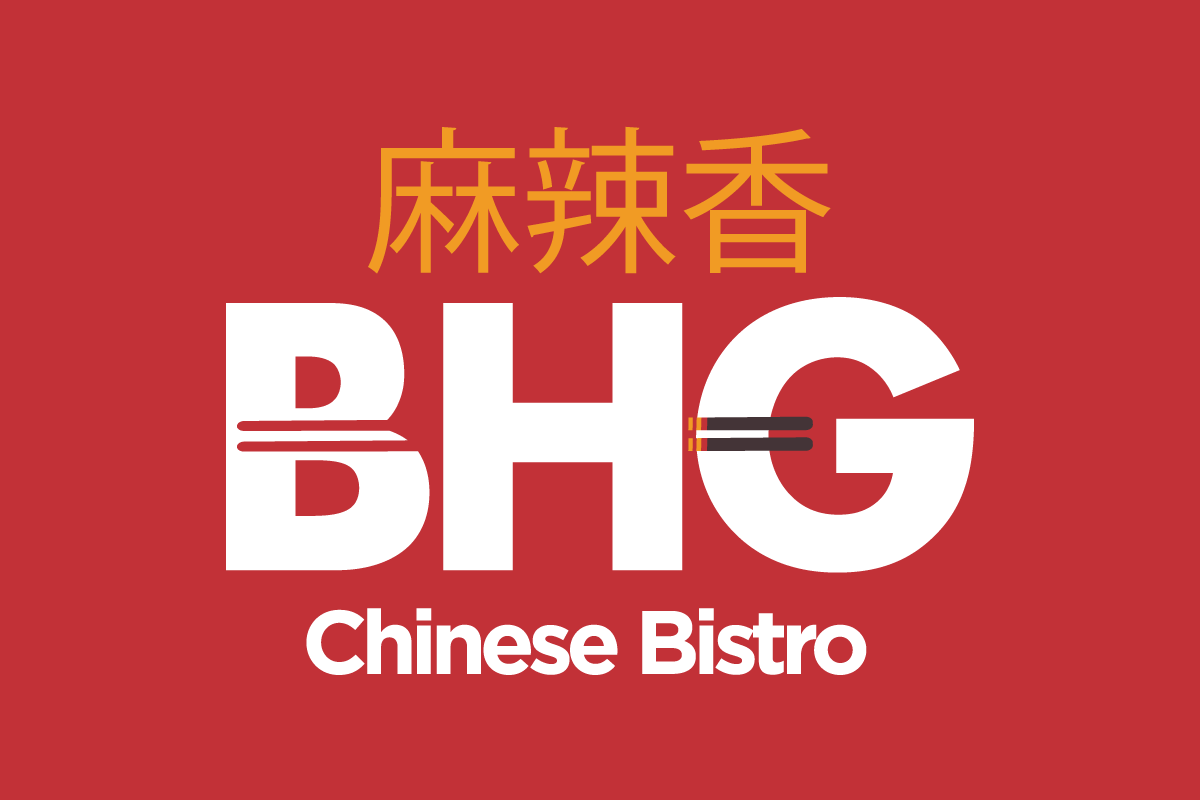
BHG Chinese Bistro Rebrand
Yum Goes by Three Other Letters
This family-owned restaurant has been a staple in the South Bend and Granger area for over seven years. They offer authentic Chinese food, as well as fusion dishes that incorporate a variety of flavors found across a multitude of Asian cuisine. They needed a logo that could represent the strong character of their brand.
| Skills Needed | Branding | Typography |
| Categories | Graphic Design |


Redesigning Simplicity
The BHG in BHG Chinese Bistro stands for Big Healthy Great, and we wanted this to be reflected in their logo with traditional Chinese characters. We chose a simple, yet strong font with clean lines to emphasize the healthy and fresh nature of their business. Overall, the logo accurately reflects the passion they bring to their cuisine.


