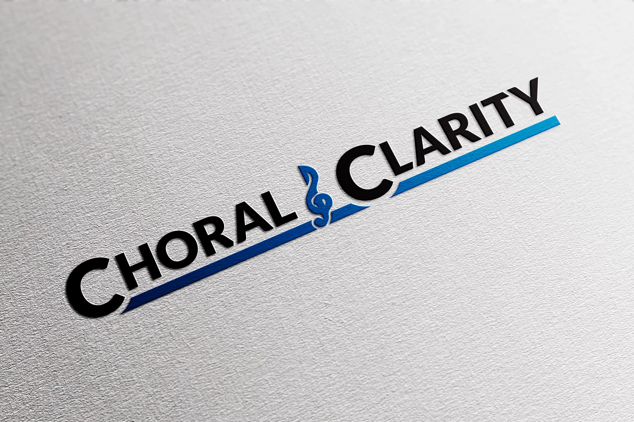
Choral Clarity Rebrand
A Focus on Clarity
Choral Clarity lacked a central brand image and as a brand was confusing. Different logos were used from social media to the company website. A conscious decision was made to unify these images and create a cohesive logo for the company itself.
| Skills Needed | Branding | Typography |
| Categories | Graphic Design |


Sonic Structure
In the conceptual phase of this design we looked at how we could both simplify and ground the logo. We borrowed elements from the existing website logo, however the issue was it lacked a foundation. The addition of the underline added this structure without harming the overall aesthetic. We then adjusted the typography most notably in the “l” and “a” in clarity as well as the “t” and “y” to give the brand a modern look fitting to its stylized treble clef. Vivid Blue was an easy choice of color due to its clear and calm nature and overall suited the brand.


