Glass and Mirrors Etc. Rebrand Consultation
In Search of a New Vision
Looking to explore new looks for the brand, Glass and Mirrors Etc. reached out to look at the possibilities. While ultimately they decided to stick with their original logo, the rationale and ideas were still worth exploring.
| Skills Needed | Branding | Typography |
| Categories | Graphic Design |


Modern Design
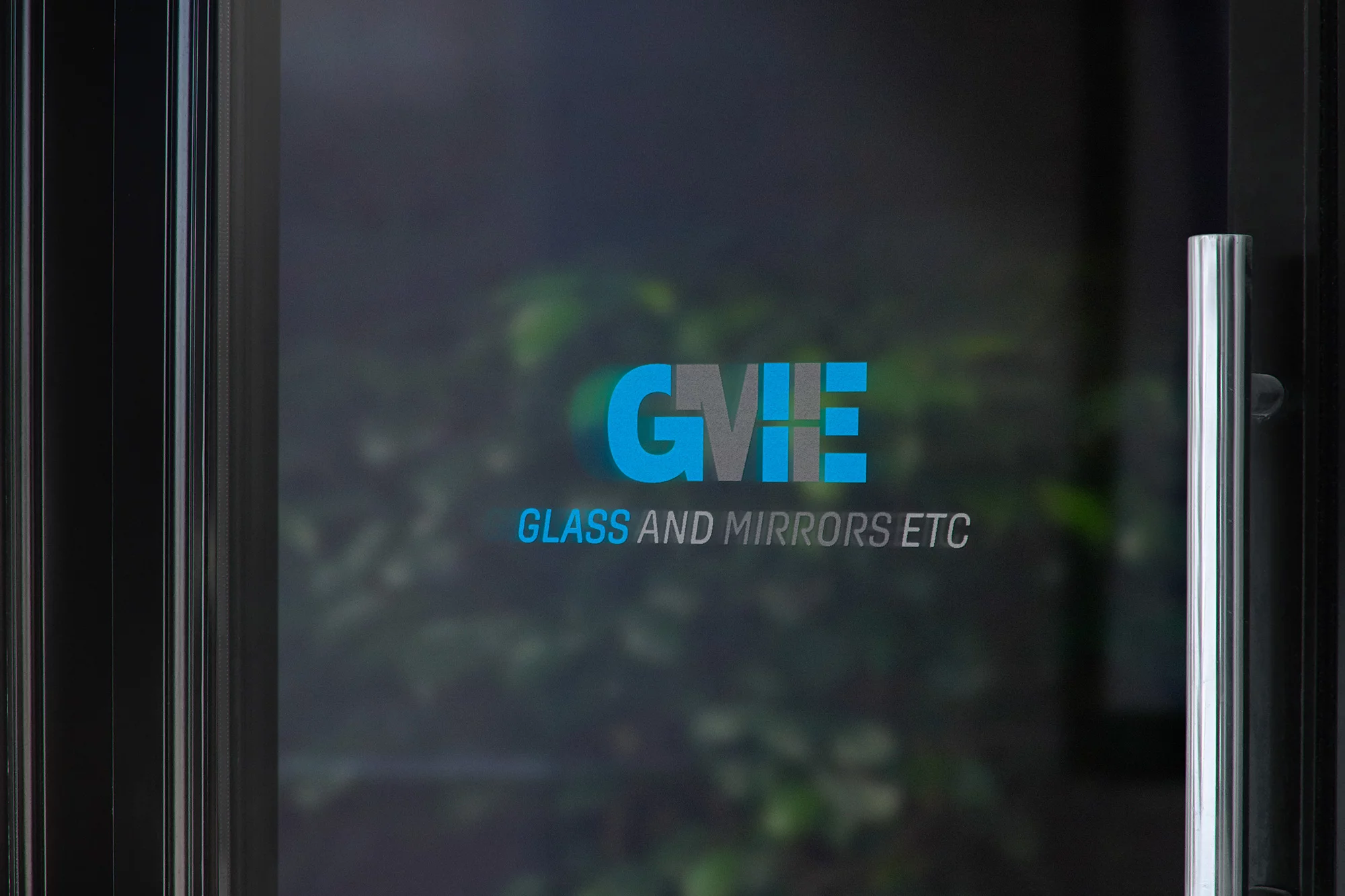
Glass and Mirrors Etc. currently utilizes a blue logo with lighter colored drop shadow done at an angle. This was very common in word art of the mid 90s and was in need of an update. Moving the blue to a lighter shade and adding in hints of a silverish grey helped to add to the overall logos sense of calm and most importantly clear. The reflecting M and E helped visualize the window and mirror that the brand has to state. Another version of the logo had the blue’s opacity dropped to 75% allowing for some imagery to show through the window aspect.