Vertical Text Alignment | Adobe Illustrator Tutorial
Overview
With the release of Adobe Illustrator 24.3 at the end of August 2020 Adobe released a new feature labeled Vertical Text Alignment. Previously only available in InDesign, bringing this feature into Illustrator is a welcome addition.
The Problem
Before, if you wanted to make text align with the middle, bottom, or equally distributed vertically through the text box, you would need to resize the text box and hope it was possible (which it wasn’t with the center of the box without hidden characters).
The Solution
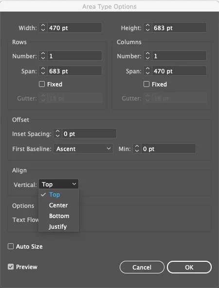
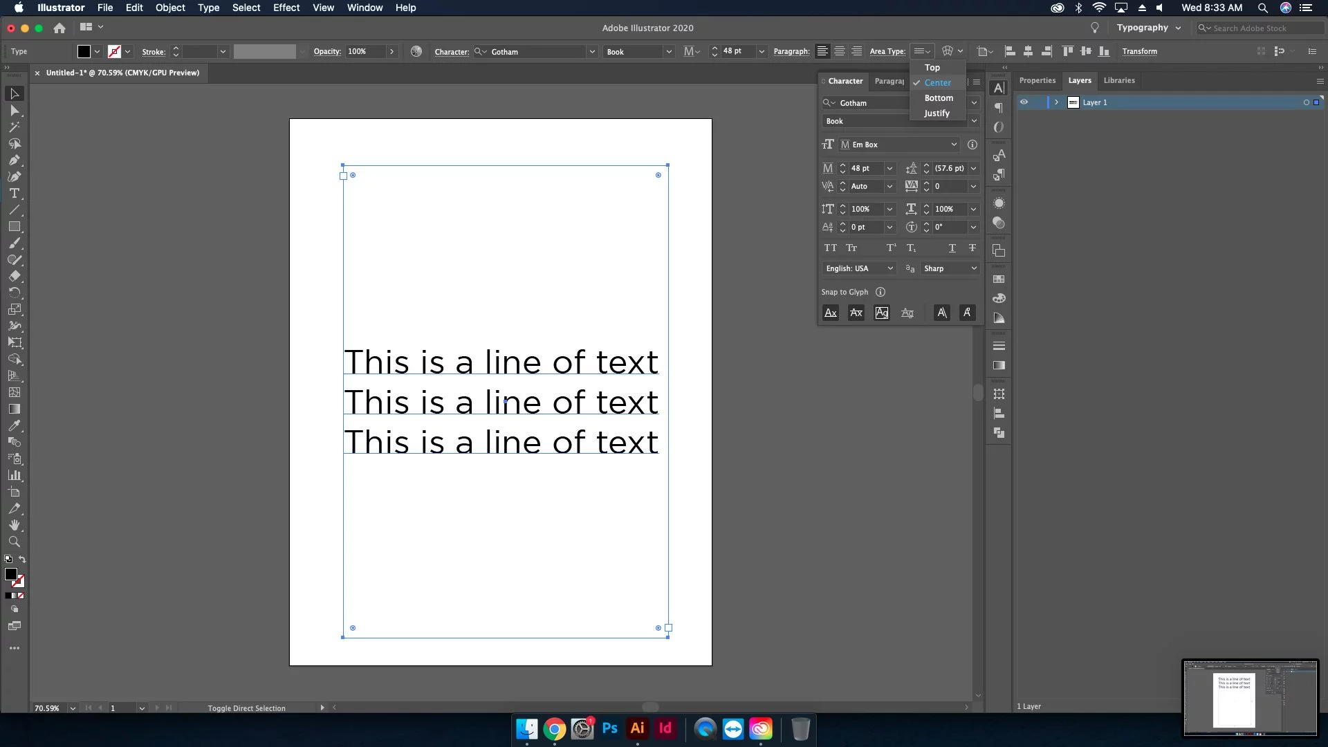
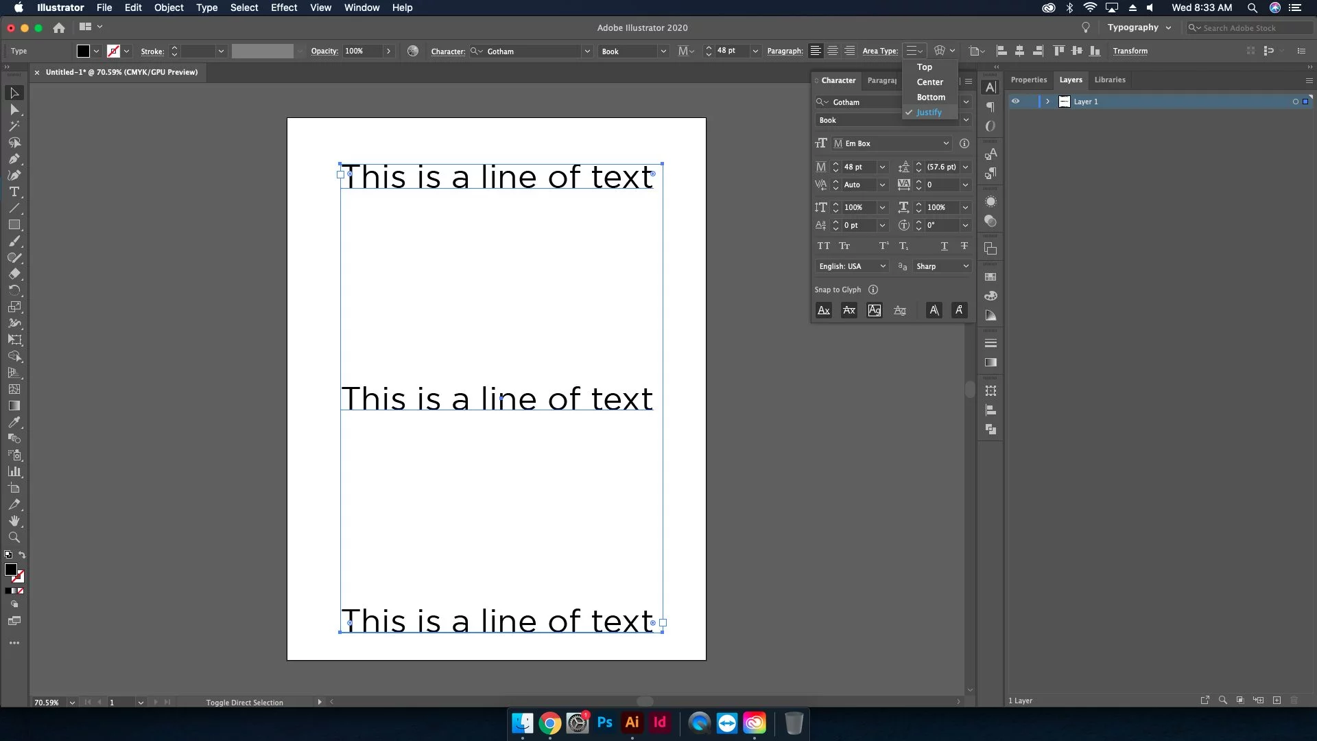
In order to access this new feature, you need to select the text frame. Next go under Type > Area Type Options. After that, choose an alignment from the following options. All these Align options are available in the Properties or Control Panel.

- Top: Aligns text to the top of the frame (default)

- Center: Aligns text to the center of the frame

- Bottom: Aligns text to the bottom of the frame

- Justified: Evenly distributes text between the top and bottom of the frame

Stipulations
“Currently vertical alignment does not work for multiple columns, multiple rows, and threaded text.” With that said, I believe Adobe is working on a solution seeing as they use the word “currently”.
Conclusion
Vertical Text Alignment is a feature that is long overdue. It helps create a smoother flow to the design experience with less hassle and is the epitome of modern UI/UX design. Solve the problems of the user in an intuitive method to improve the experience with the program. Features like these are key to Adobe staying at the forefront of the design space. Check out our other articles on the 24.3 update: Snap to Glyph | Font Height Resizing Options | Align to Glyph Bounds | Selective Unlock


