What is a Mega Menu? How to Design an Effective Mega Menu
What is a Mega Menu?
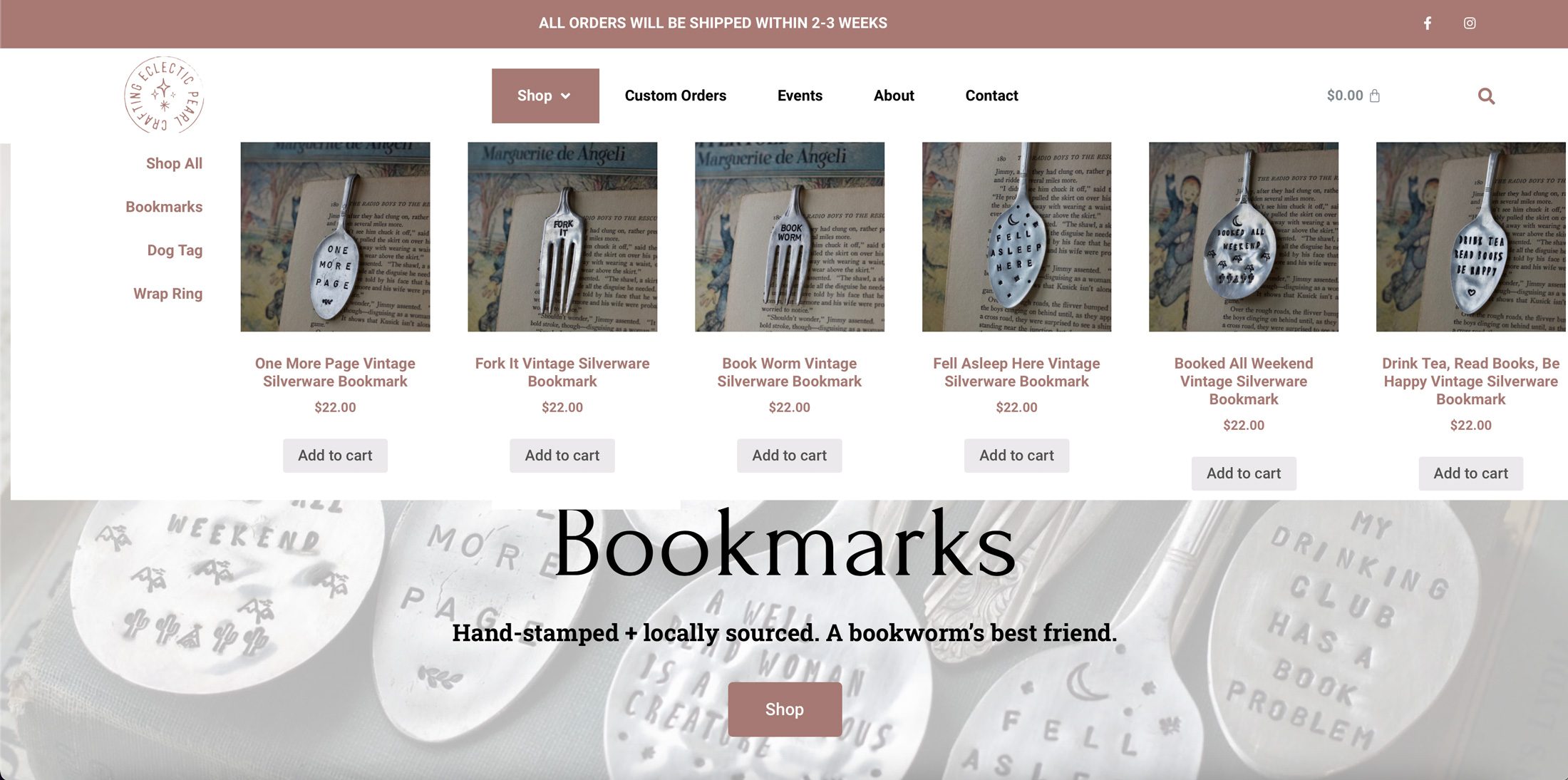
A Mega Menu is a menu that expands out of the base navigation (much like a drop down) that contains text, images, widgets, etc. These menus can often be found on e-commerce websites as well as sites with a more complex navigation than the traditional home page, about, contact, etc. Menus such as these offer more than just basic links and can often include visuals, descriptions etc.
Mega Menu Design Tips
Make it Short in Height
Mega Menus should not get in the way of the user experience. Instances have arisen where the menu can be intrusive if made too tall. A good rule of thumb is to keep the height of the header plus the menu no larger than half to 2/3rds the screen height. This will keep people from getting frustrated by having to move off the page to get the mega menu to be off the screen.
Keep it to Below Five Columns
Under each mega menu dropdown try and keep the number of columns as reasonable as possible. For example, if there is a need to show off products within a certain product category, one such way to use a mega menu is to have a navigation bar in one column and then four products in their own columns. This is of course as long as height is not an issue, sometimes more columns can be added if the height is too big at five columns however be mindful of overwhelming the viewer.
Think of it as a Small Preview Page
One way to approach designing an effective mega menu is to think of the design as a small preview page for the menu item. Visually indicate what the customer can expect to find when they click on the menu link.

Mobile Optimization
Don’t forget mobile users. Mobile optimizations are a necessity no matter what in web development and a desktop mega menu is not going to be effective on mobile as it will be too large and negatively affect the load. Maybe instead opt for a more traditional mobile menu interface with a featured product at the bottom.

Conclusion
Mega Menus can be very beneficial to ecommerce websites as well as sites with complex navigation systems. Developers need to ask if the addition of this kind of menu is an absolute necessity for the site, however as oftentimes they can become more trouble than they’re worth. Remember good design always has a purpose behind every element and action.


