Typography: An Overview | Fundamentals of Design
Overview
A visual art form often forgotten, typography is the purposeful arrangement of text. Good typographic design takes into account legibility, information hierarchy and aesthetics to give the reader a better understanding of the topic.
Typography has its roots in calligraphy. Predating the printing press, calligraphers would hand print or copy text. This was very slow and inefficient.
Typography was revolutionized with the printing press. With Gutenburg style presses, typographers would “set” the type by hand. This means that the operator would take individualized metal pieces for each letter, space, and line break. Machining like this enabled presses to print 90 times more pages than a traditional hand copy.
Modern typography has seen constant evolution since those early days and is now more accessible than ever before, sometimes to its own detriment. The advent of the personal computer has sought to this fact. Now more than ever people can work with type in new and exciting ways. But what truly is typography?
Spoiler:
Typography is more than just picking a nice looking font from a dropdown menu and calling it good.


Importance of Typography in Design
Typography plays an important role in design, from print to digital it influences your ability to process information and keep your attention.
Subliminal Recognition and Influence
Believe it or not, typography gives brands a voice and personality. With nothing more than type, one can create an influential campaign.
Stimulation
Visually pleasing and visually stimulating type are two different concepts that need to be discussed before moving forward.
Visually pleasing type may sometimes even appear as boring, however that’s often the point. It is supposed to be clean and readable as to convey information clearly.
Visually stimulating typography is the next step in what you can do to make the type stand out in a way that is out of the ordinary. Think of this as the A+ student’s work in school over the B student. Sure, both of them understand the concepts but one outperformed the other in a way that goes beyond following the guidelines.
Elements of Typography
Typographical terms and elements are broken down deeper in our article here (coming soon).
Typefaces
Typefaces come in a wide variety of options. From serifs to display, a typeface is a family of fonts composed of a certain style and defining characteristics.
Contrast
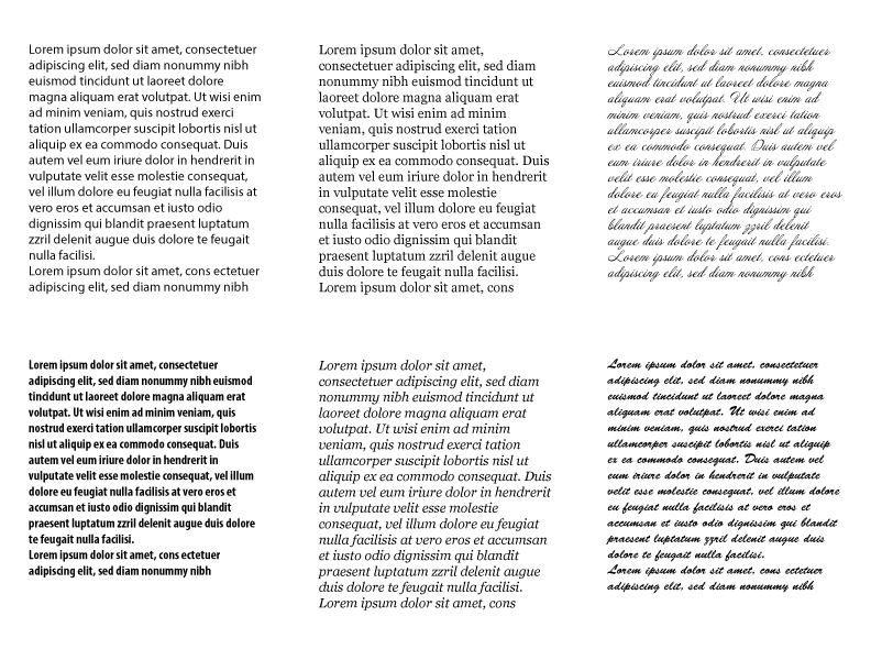
One of many ways to spice up your design is through the fundamental principle of contrast. Having high contrast in fonts in either weight or type choice can add to a design.
Consistency
Contrast is important, but so is consistency. Limit the amount of typefaces used to allow for a clean look. When too many typefaces are used the design becomes cluttered and unprofessional (usually).
Negative Space
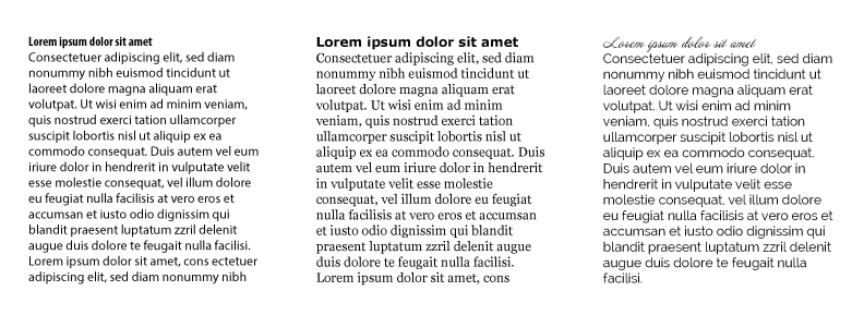
Proper spacing between text and images as well as other text is key to understanding. Allowing each item its own room to breathe keeps the design from looking chaotic or cluttered.
Alignment
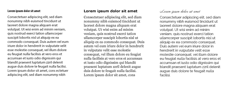
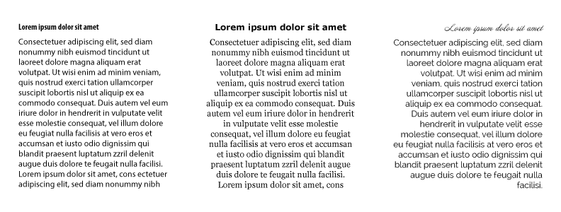
Whether center, justified, or right aligned, text alignment is an important fundamental for typography. Depending on the text available certain options are better than others. For simple headlines centering can be acceptable, however for long bodies of text be careful utilizing centered text.
Color
Exciting yet challenging, color offers the designer some liberty in creativity. Composed of hue, value, and saturation, color can be paramount to establishing a stimulating design. Adding emphasis through accent colors can help draw the viewer through the information. Color can also help add a certain mood to the design.
Hierarchy
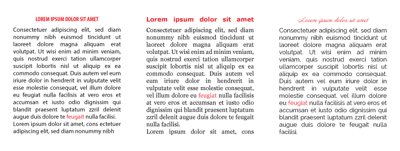
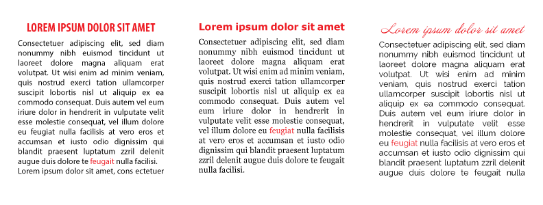
Hierarchy is probably the most important basis for legible typography. Formed from the aforementioned color, alignment and contrast as well as size, these subtle visual cues give rise to an order of how to read a design.
Think of how a newspaper is structured, utilizing nothing but size and contrast; they are able to effectively communicate the order from heading, to sub-heading and body text.
Where to Start
Typography can appear like a mountain one must climb, however much like skiing, there are core fundamentals that can be applied to make the mountain into the bunny hill.
Function
The first aspect to typographical design should always be function. Think of yourself as the makeup artist to type. The story must be told, however it’s your responsibility to make sure that the type is presentable. Ask yourself what function does each section of text serve? Is this section body copy? Is it a title? Layout the hierarchy and allow the type to fulfil its core function all while thinking about what functions each section should fulfil.
Performance
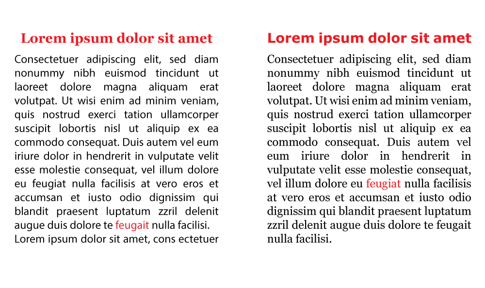
The next section of typography fundamentals should be performance. Will this type be featured in print or on the web? If on print the habits are different than on a website in terms of what people use. For instance in print the serif and san-serif font combination works with the serif typeface being the body copy while the san-serif is used for the headline. In web design however the combination is flipped with the serif typeface being used for the headline.

Personality
Each typeface has an implicit set of traits that defines a personality. Utilize what each font is saying to your advantage. Think of Times New Roman, this typeface excels on printed media due to its inherent characteristics. Verdana works well on screens due to being a sans-serif font with a high kern and track which on low resolution screens was a necessity. Listing out the desired personality traits of the design and matching fonts to this design allows for unity.
Tone
Just like a personality, typefaces can carry their own tone. Certain fonts say angry, sad, feminine, masculine, etc. in terms of how they are designed. Matching the tone of the design with the font is essential for the font not looking out of place.
Inspiration
A common practice for many is to just look around and see the work of others. Find the three to six ideas and concepts you like and build from there. Not only does this practice help channel your creative vision, but it also allows for you to already grasp what works and does not work within reason.
Experimentation
As we have said multiple times, experimentation is the secret to success. You won’t know until you try. Test everything under the sun to ensure the best possible result.
Conclusion
Typography is not usually listed as an element or principle of design, however is an extremely important concept to wrap your head around. Almost any design with information will contain typographic design of some kind. Understanding how these traits work is essential. Stay tuned for our next article on the terminology behind typography.

