Align to Glyph Bounds | Adobe Illustrator Tutorial
Overview
With the release of Adobe Illustrator 24.3 at the end of August 2020 Adobe released a new feature labeled Align to Glyph Bounds. Keeping in theme with the other upgrades in 24.3, you can now differentiate whether to align to the em box or the actual glyph bounds.
The Problem
Before, if you wanted to align imagery with text you would have to look at where the center of the textbox is or the bottom and move the image accordingly. Now that is still an option, but it can all be done with the push of a button.

The Solution
In order to access this new feature, you need to open up the Align panel.
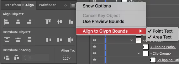
In the Align panel click the hamburger/flyout menu and choose Align to Glyph Bounds. Then select whether you’re using area or point type. Point type is one long string of text unless manual line breaks are added. Area type has a box to conform to and will automatically break when it reaches the bounds.
Select the object and the text

Choose an alignment option within the Align panel. The object will now be aligned with regards to the glyph bounds
Conclusion
Align to Glyph bounds is a small but welcome feature. It helps create a smoother flow to the design experience with less hassle and is the epitome of modern UI/UX design. Solve the problems of the user in an intuitive method to improve the experience with the program. Features like these are key to Adobe staying at the forefront of the design space. Check out our other articles on the 24.3 update: Snap to Glyph | Font Height Resizing Options | Vertical Text Alignment | Selective Unlock.

