KISS: Keep It Simple Stupid | Fundamentals of Design
Originating in the United States Navy, the age old adage “keep it simple, stupid” is a fundamental that can be carried to most graphic design work (notice I say most). My first graphic design professor used to constantly say this and it really stuck with me as a fundamental principle I usually abide by.
Generally clients want everything and the kitchen sink, but that can be detrimental for a number of reasons. We will take a look at some of these reasons and what to do to keep designs simple and clean, as in this instance the customer is generally wrong.
Origins
US Navy
One of the major early proponents of K.I.S.S. was the United States Navy. Credited to Kelly Johnson by some, the lead engineer at Lockheed Skunk Works insisted that designs were simple enough to be repaired by the average soldier with basic mechanical training and simple tools. Reason being is that if a failure were to occur lives could be lost and the product could become worthless or obsolete.
Simplicity as a Design Principle
Think of yourself as a guide on a museum tour, or an editor to a novel. Your job is to find what works and cut the rest. You are an information architect
Always Have A Reason
One of the most common things I get asked is “why is X piece there?” and if you ever respond with “I don’t know” you’re doomed. Being able to clearly articulate a point as to why a certain design element is there will help aid in clients understanding why. If you can’t find a reason for an element of a design to exist, then there probably isn’t one. However, if there is a reason, then you should work to make everything integrated.
Simplicity is Not the Only Objective
Oftentimes the brief will have various objectives that the designer is tasked with achieving. Keep the other objectives at the forefront of the design.
Simplicity in the UI/UX World
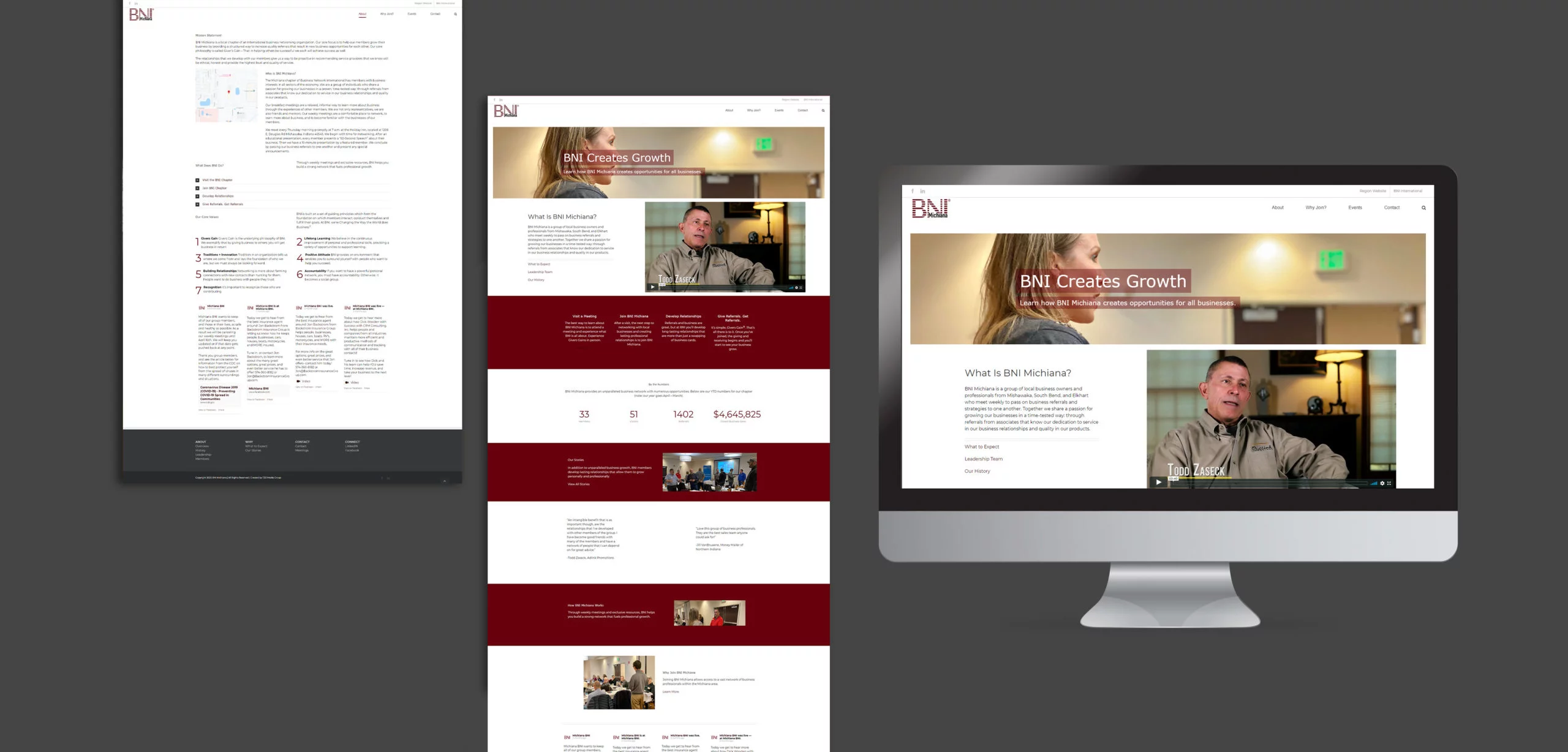
UX design has kept the principle alive and well within the 21st century. Users lead busy lives and don’t care how creative things are but rather are focused on how the product/service helps them.
Navigation
Typefaces come in a wide variety of options. From serifs to display, a typeface is a family of fonts composed of a certain style and defining characteristics.
Examples
Here are a few examples of K.I.S.S. in action.
Midwest Spray Foam
Midwest Spray Foam’s logo had extraneous details that were not needed to convey the brand message.


TJ21 Website
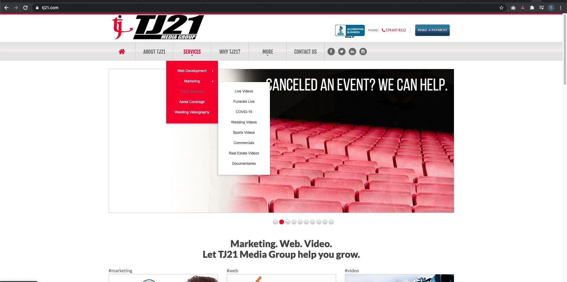
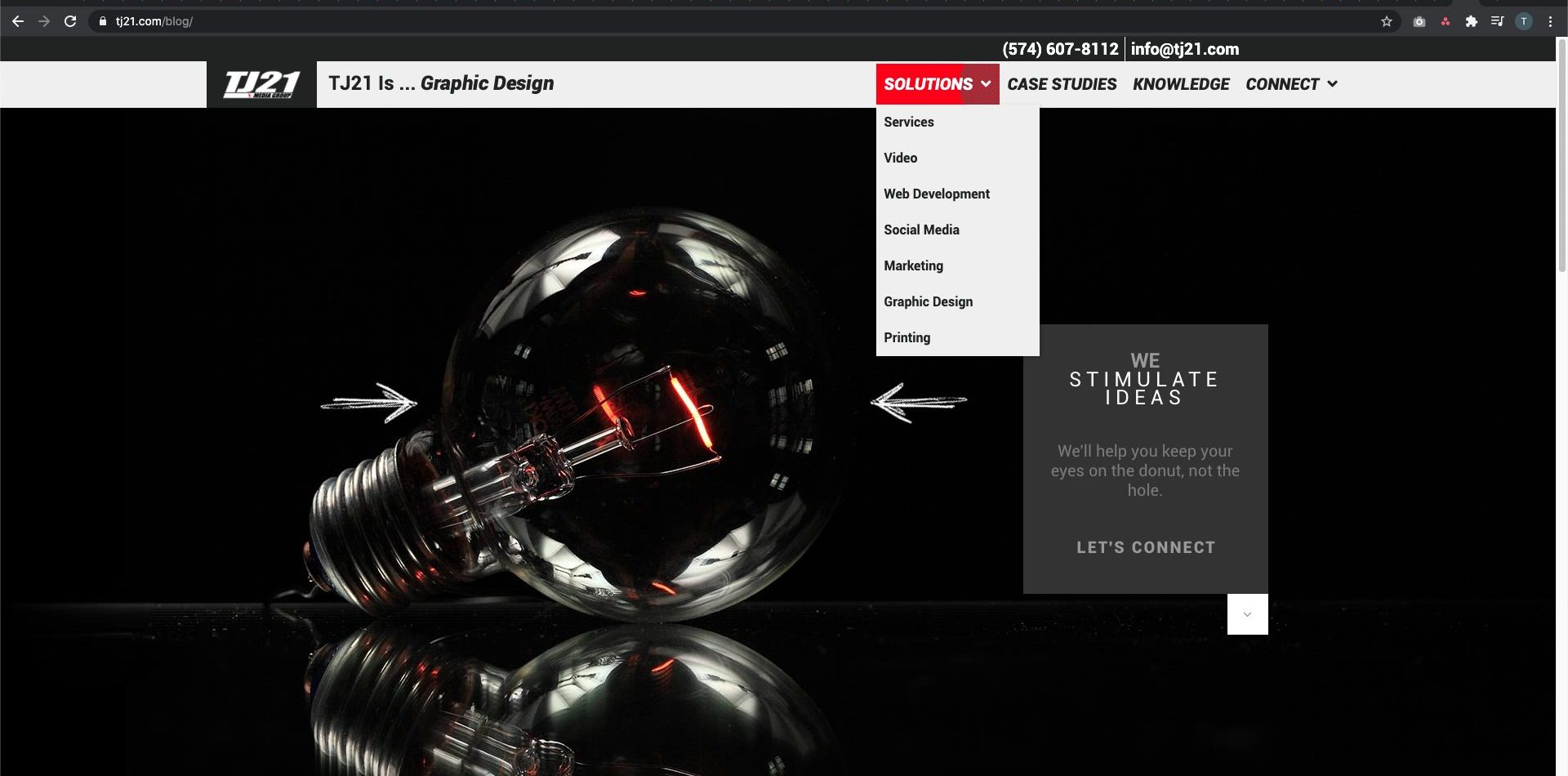
The TJ21 website navigation and overall user experience was undesirable. First off there were too many items in the main navigation. There were 7 items in one sub-navigation, and in a separate sub-navigation there were 8 items in another level sub-nav. That sentence’s complication should say it all. Navigation wasn’t the only thing in the header either. 6 menu items have been reduced down to 4 to streamline the user experience. The most sub-navigation items now are down to 4 at maximum.
The streamlining didn’t cost us any content either, it just forced us to move some things around and rearrange as needed. We still had all the same pages, however instead of being in the navigation it is now integrated into the site. Combining this with other design principles we were able to optimize the new website for the end user and increase conversions.

