Hierarchy of Information | Fundamentals of Design
Overview
Hierarchy of Information is an important concept for designers. In the current age of information having a clean layout is impeccable to success. So what is the hierarchy of information? This can be defined simply as the organizing of information into a flow based on the importance to the consumer. A key concept to Information Design.
Importance of the Concept
Hierarchy of information sometimes also called visual hierarchy is the arrangement of elements of a design according to the visual weight each element possesses. Visual weight is determined by a number of factors and is the determining factor on what the viewer focuses on in what order.
Evolution
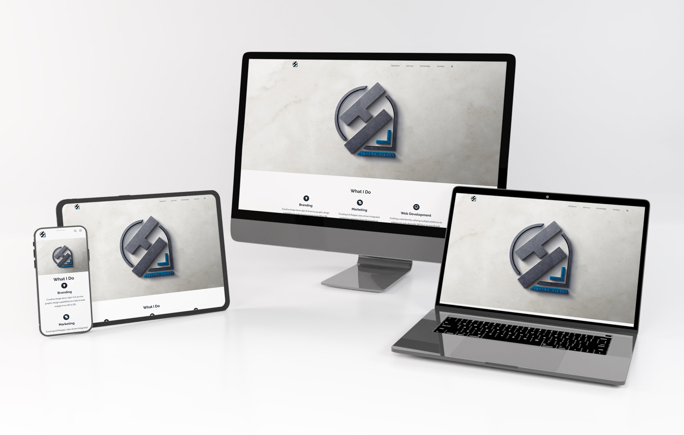
From paper to the screen information design has evolved as time has gone on. Responsive design has forced designers to break out of the mold and create a consistent design across multiple platforms.
Elements of Hierarchy of Information
Reading Patterns
Cultures may read left to right however reading patterns can be more complex. Reading patterns typically fall into two categories, “F” and “Z”. These two patterns are the most common however there are plenty others.
F Reading Pattern
An F shaped reading pattern pertains to designs with a high volume of text such as blog articles. Viewers read the article from left to right, scanning for important headings and key sentences. Short bold headlines all left aligned are a surefire way to format an F shaped reading pattern. Utilizing bullet points and other such items to break up the text can add visual variety and help with comprehension.


Z Reading Pattern
The Z shape pattern is utilized in pages where information is not presented paragraph after paragraph. Typically you see this on the web pages as designers try and conform primarily to this pattern of design. Readers scan from the top left to the top right and then down to the bottom left to the bottom right. Naturally the information of highest importance is placed in the corners with a connecting diagonal.
Size
One of many ways to spice up your design is through the size of the elements in question. People read bigger things first. An element that is larger commands more attention than something smaller and can even override reading patterns themselves. Think about every title and subtitle and how they become distinct from one another.

Space and Texture
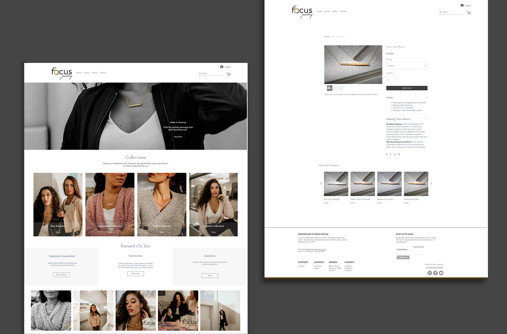
Negative space is a fundamental concept of design that can add a more elegant approach than just increasing the size of elements. Allowing content to breathe signals its importance to the viewer and thus upgrades its hierarchy. Texture in this case refers to the overall arrangement of the design itself.
Typographic Choices
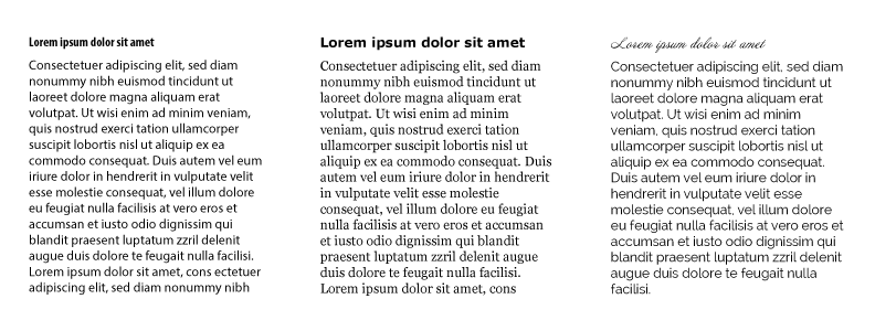
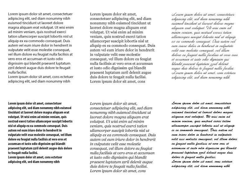
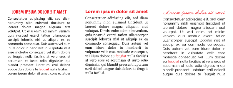
Typography as we have started covering with this article is a landscape of possibilities. From style and weight to stroke width typography offers a near limitless landscape of possibilities. Variance in typographic choices can create hierarchy without becoming monotonous.
Color
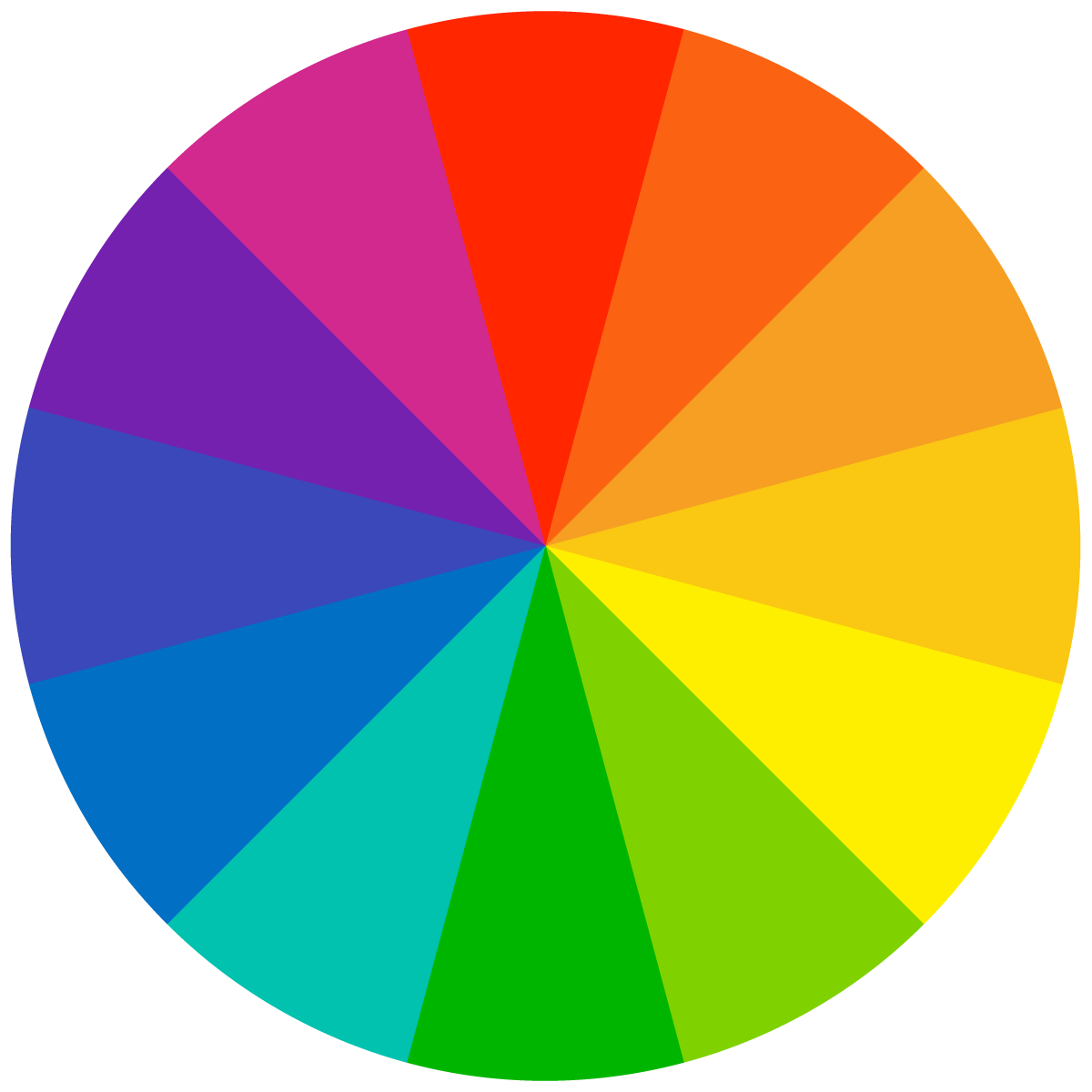
Bright colors will always stand apart from greyscale and muted colors. This of course is a no-brainer concept to understand, especially if you’ve read up on the series on color I wrote earlier.
In terms of visual hierarchy though, lighter tints appear more distant and lower in terms of hierarchy than that of their darker counterparts.
Direction
Grid design has become a staple of presenting information to viewers, and we’ll cover the topic soon, however it is not the only methodology to presenting information. Breaking the grid and giving designs movement can immediately catch that attention of the viewer. Take for example diagonal text on a grid, immediately you are drawn to the text which breaks the mold, thus giving it a heavier weight than its other elements.
Where to Start
How does one begin creating hierarchy within a mountain of information? In both heavy and light text designs I generally find myself doing the following.
List the Information
Listing out the information lets me know what I have and maybe need before I can grasp the full extent of the design. Certain items like date and time are important for events and thus need to be listed.
Arrange the Information
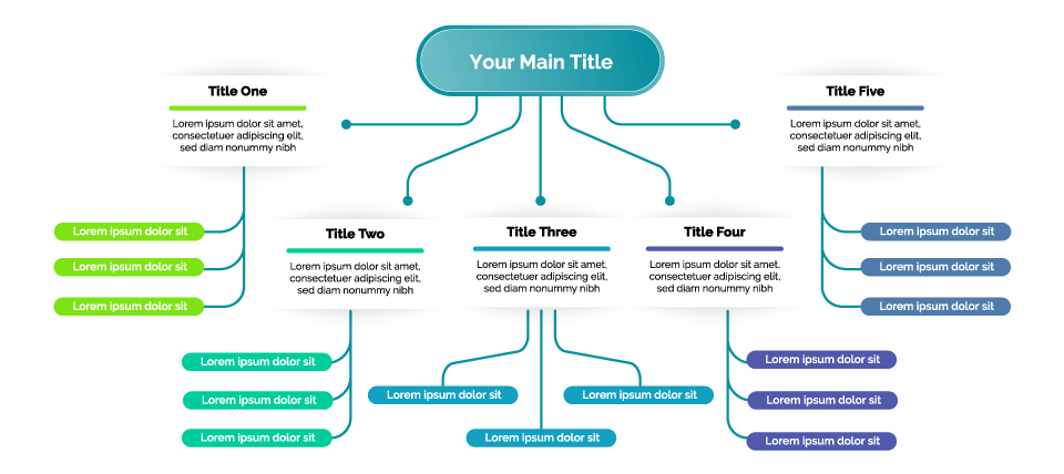
Once I know what I have (and don’t have) I tend to arrange everything from most to least significant. What’s my title? Subtitle? Key points?
Once I have an arranged, usually numbered list I can then begin to create the elements and their defining characteristics.
Create a Unique Descending Look
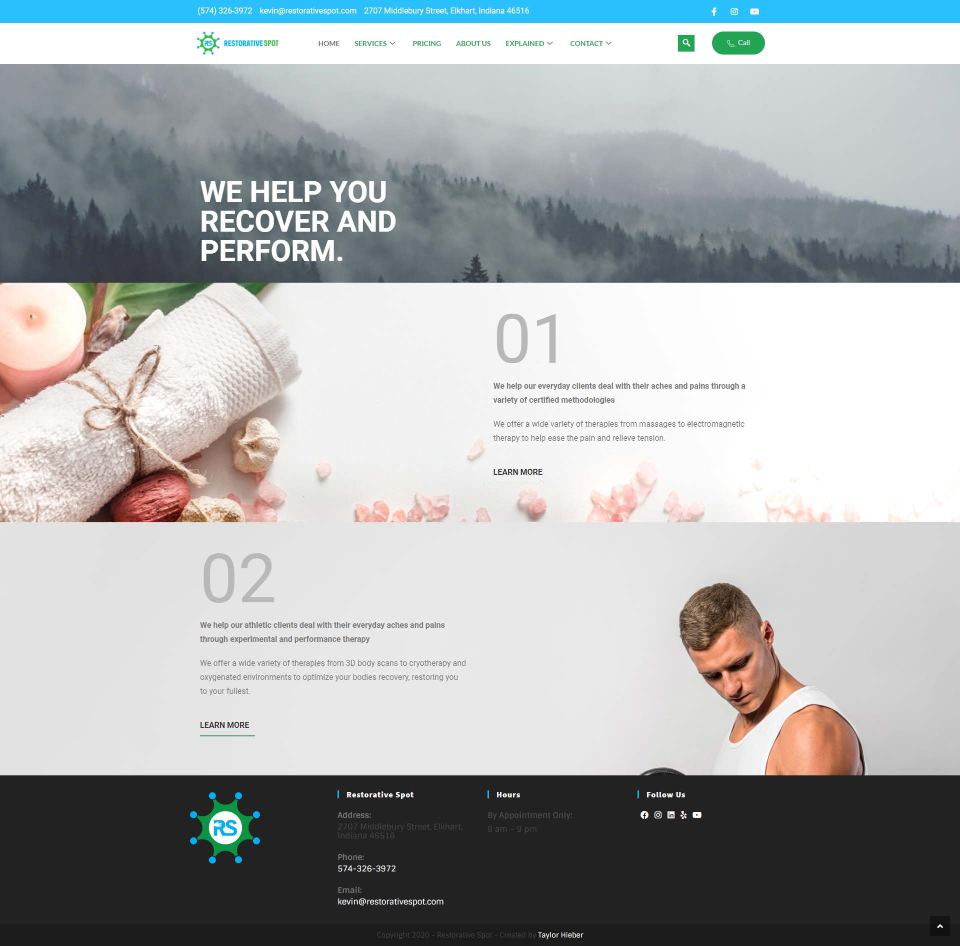
Starting with the most important elements and working my way down through unique touches such as a big title followed by a slightly smaller subtitle. Using color and the weight of the typeface to give weight to the headings and so on.
Creating unique characteristics can be challenging and you definitely don’t want to overdo it. Clean design is of course the end result of all of this after all.
Consider the Flow
Flow is a hard thing to quantify, so I generally think of it as such: if a person devoid of knowledge can pick it up and understand the structure and layout without getting hung up on where to look next, then the design flows.

Conclusion
We are living in the information age. People are in a rush to get answers as quickly as possible because time is money. No longer do people have time to try and guess at meaning. Rather people want to be able to simply look at a document, scan for the needed information, and find the solutions to their problems. Even looking at modern day SEO can tell you that this is becoming a higher priority with companies like Google directly saying they want information to be organized, concise, and clear to the end user. Hierarchy of information is a fundamental key to information design that will never go away, so take the time and save your future self some time.

